Covid-19 Policy Comparison
This is a clustering project where I compare the government responses to Covid between countries that faced similar Covid fatality rates. I used dynamic time warping - an algorithm which measures the similarity between two signals irrespective of time. The dataset contains information on 229 countries.
Background
During the course of the pandemic, I had many conversations with people who argued for or against the efficacy of certain Covid-19 policies. I also questioned if lockdowns were necessary much later into the pandemic, so I looked to see if the data show me which policies have been useful to reduce Covid fatalities.
My first task was to cluster countries which experienced similar Covid fatalities. I found a way to cluster countries with similar Covid fatalities irrespective of when the peaks came using the dynamic time warping algorithm. The algorithm I implemented is found in many packages. The package I found most useful is the ts-learn package because of its out-of-the-box clustering function.
My second task after clustering was to understand what policies were imposed during peaks of Covid fatality for each country within the cluster.
Goal
Compare policies between countries that experience similar Covid fatalities (by month).
Data
I used the Google Covid-19 dataset hosted on github. The github page consists of multiple datasets that contain information related to the pandemic like masked movement data, economic data, demographic data. You may find the full data set here.
For this project I have used the following datasets
| Dataset | Content |
|---|---|
Index |
Various names and codes, useful for joining with other datasets. |
Government Response |
Government interventions and their relative stringency. |
Epidemiology |
Covid-19 cases, deaths, recoveries and tests. |
Demographic |
Various (current) population statistics. |
Implementation
The full notebook can be found on my github page.
Cleaning
I wrote a simple for-loop to iteratively calculate the inertia for each n number of clusters.
# Step 1: Initialise empty array to store inertia values
intertia = []

# Step 2: For-loop to get inertia value for n-cluster
# n-values of 1-100
for i in range(101):
 	if i ==0:
     	pass
 	else:
 	# km is the name of the model which we use to cluster the Covid-19 fatality signals.
 	# We specify the parameters of the model in the function TimeSeriesMean.
     	km = TimeSeriesKMeans(n_clusters= i , metric="dtw",
                    	random_state=0, dtw_inertia = True)
     	inertia.append(km.fit(X).inertia_)

# Step 3: Store the log of the inertia values
# in a dataframe "intertia_df"
inertia_df = pd.DataFrame({
	'inertia' : inertia,
	'inertia_log': np.log(inertia)
}).reset_index()

inertia_df['index'] = inertia_df['index'] + 1
inertia_df = inertia_df.rename(columns = {'index':'n_clusters'})
inertia_df['n_clusters'] = inertia_df['n_clusters'].astype(int)
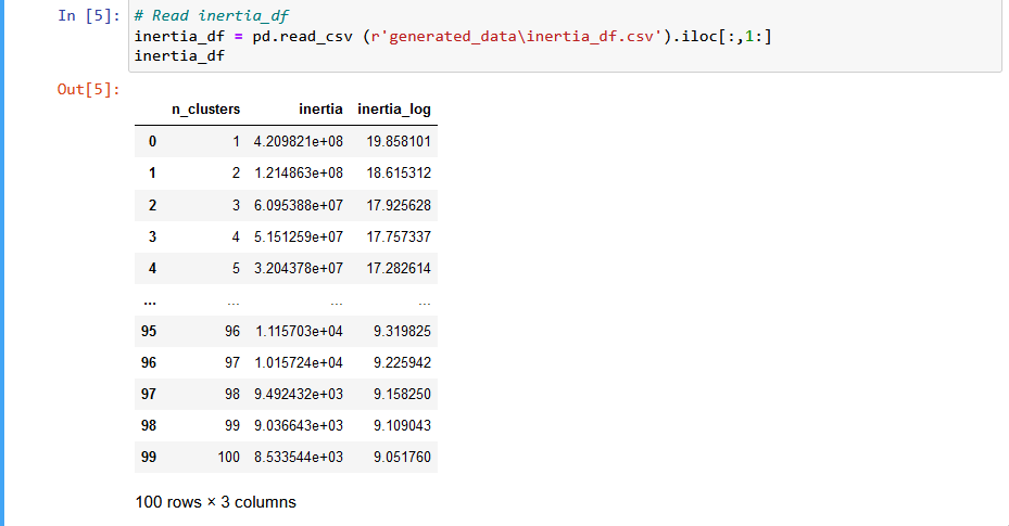 Output of inertia dataframe.
Inertia is a measure of how well a dataset is clustered. A good model aims for a lower inertia score and low number of clusters. For example, a streaming service wants to cluster clients into categories based on what they watch. Too much inertia and you might risk over generalising your customers by grouping them in the same category when they are quite different. This will lead to inaccurate show/movie recommendations. However, too many clusters will make interpretation difficult or less intuitive. Therefore finding the right balance is key.
Clustering
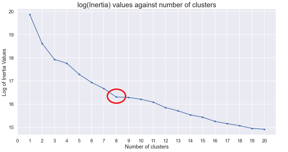
I chose 8 clusters using the elbow method.
Results
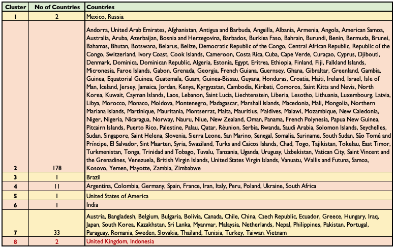
We observe there are a few countries that suffered fatalities on a scale that is incomparable with other countries, like cluster 1,3,5,6. On the other hand clusters 2 and 7 contain many countries. Further analysis could look into further clustering clusters 2 and 7.
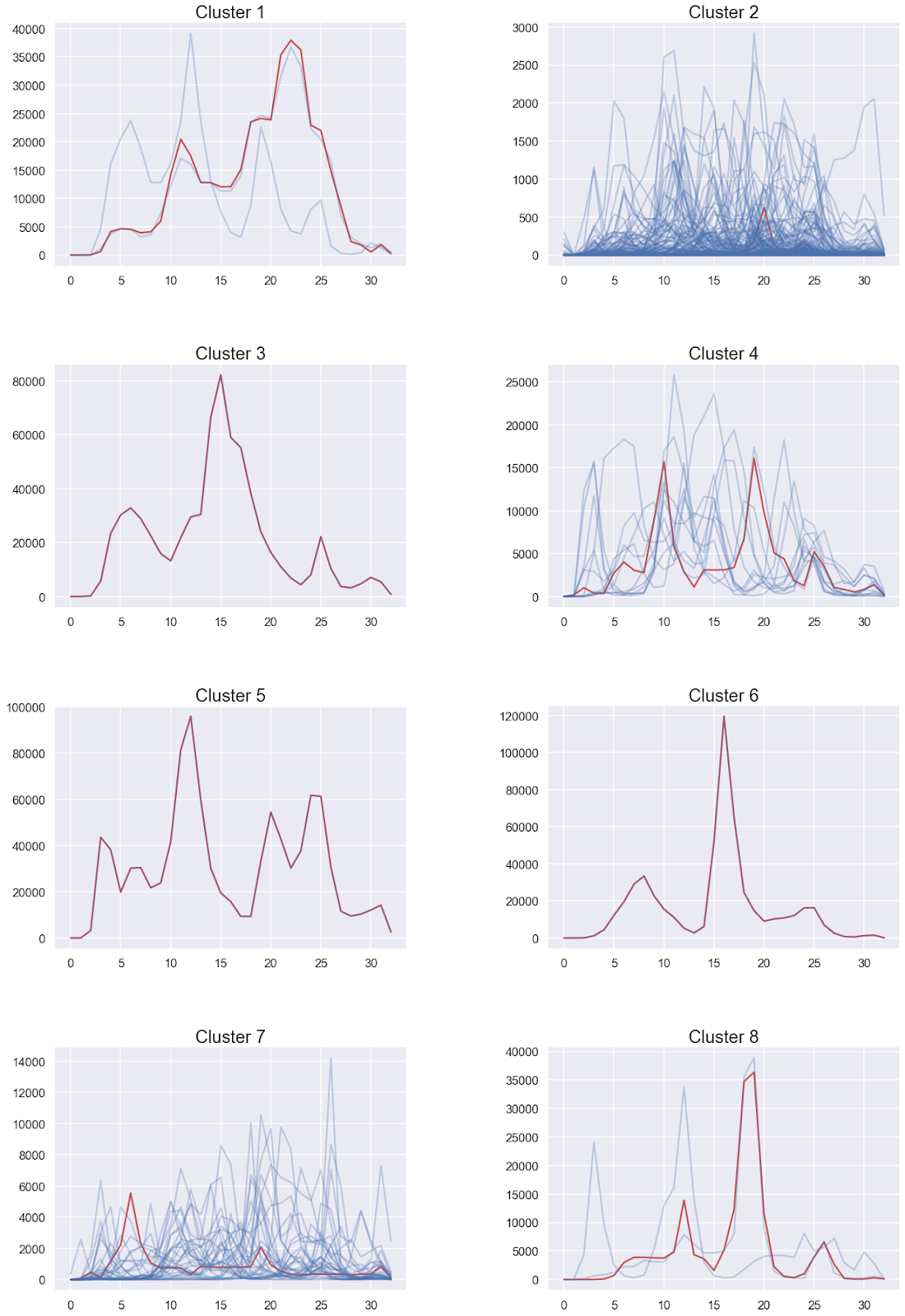
Another insight we can gain from dynamic time warping is the general trend of peaks in fatalities. For instance, we observe that countries in cluster 4 are characterised by two Covid peaks. Upon closer inspection, we see that the countries in that cluster really do experience 2-3 Covid peaks during the 33 months (Jan 2020 - Aug 2022). For a full list of all the countries within each cluster, scroll to the bottom.
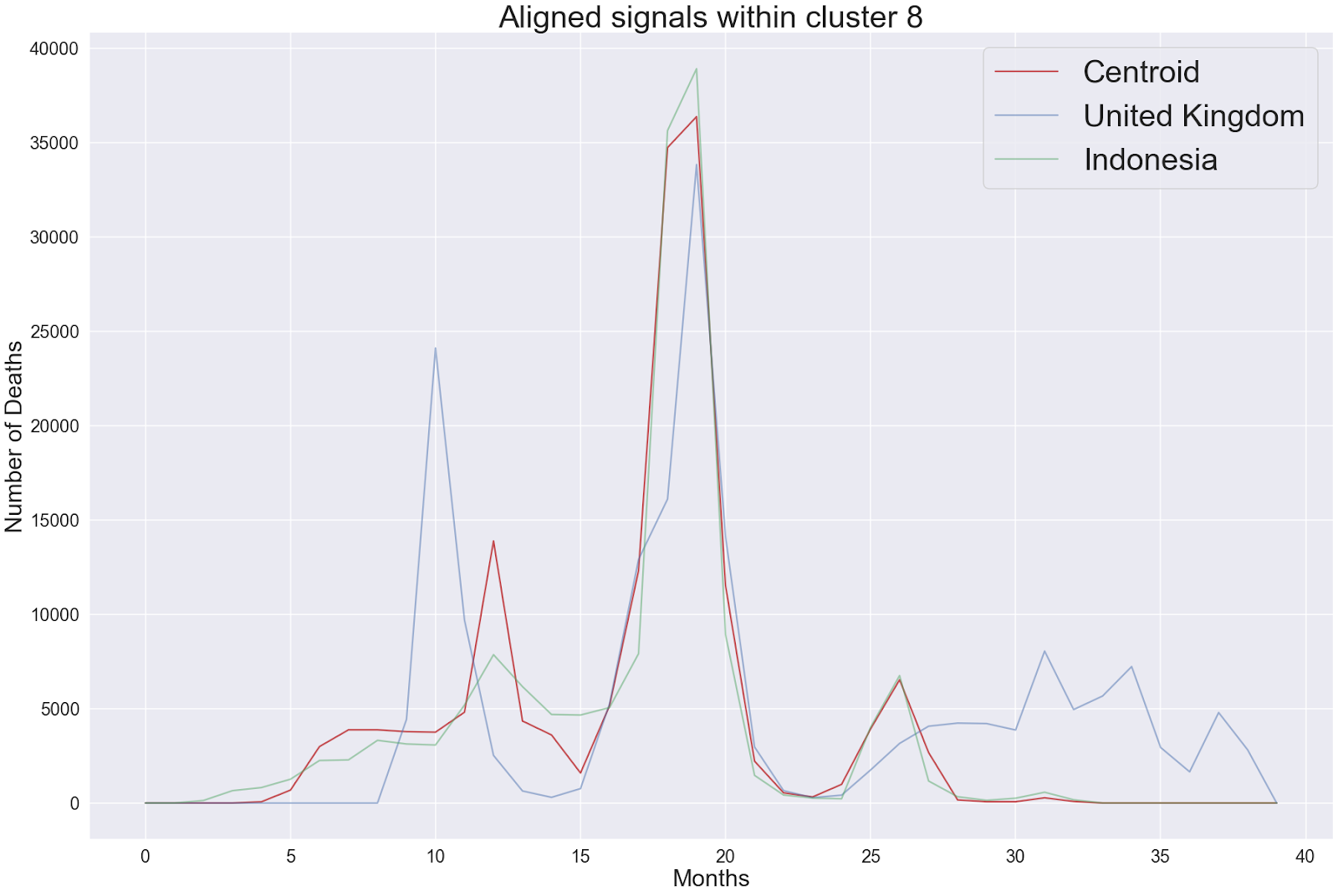
Cluster 8 (Closer analysis)
Indonesia and the United Kingdom
We now use cluster 8 demonstrate how aligning the two monthly fatality signals can help us compare government policies. Within cluster 8, we see that the peak Covid fatality takes place in the United Kingdom (UK) 7 months earlier than in Indonesia. We see that the peak number of Covid fatalities in both countries is very close after we aligned the two signals together (right figure).

The visualisations of government policies during the peak in Covid fatalities is shown below.
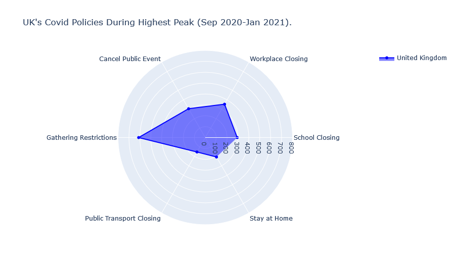
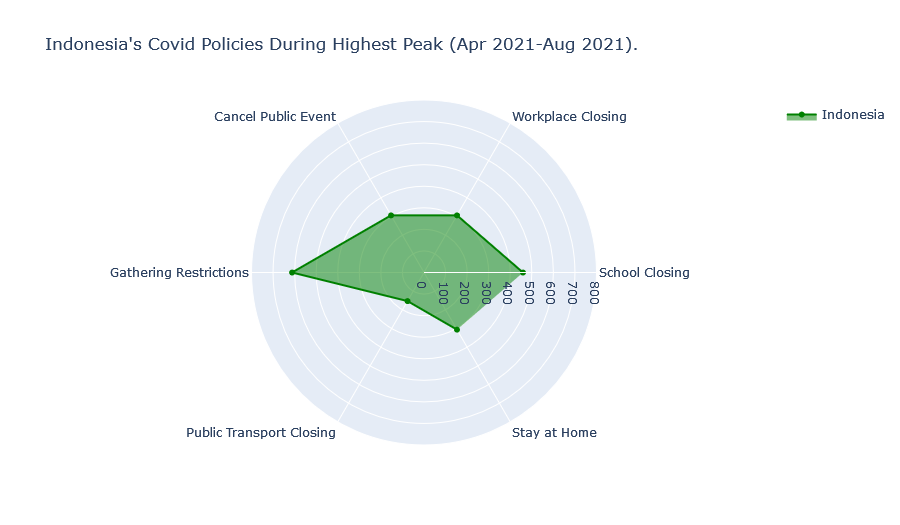
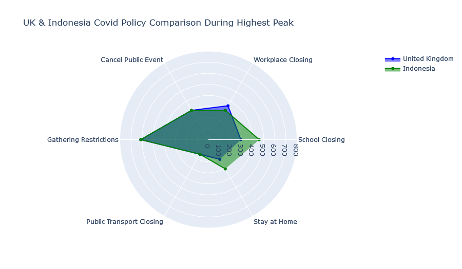
We find that Indonesia and the UK’s Covid policies during the highest peak of Covid fatalities were largely similar. Although Indonesia has historically imposed stricter “School Closing” and “Stay at Home” policies while the UK has imposed slightly stricter “Workplace Closing” policies.
The same analysis can be repeated for countries in other clusters.
List of countries per cluster: